

Embossing is great, right? Here at Let's Squash It! we love to challenge ourselves and to see if we can take embossing a little further to add extra 'Wow' factor to your cards. In this post, I'm going to be looking at how to add a little shine to your embossing to lift it to a whole new level!
My first thought for adding some shine to an embossed panel was to use gilding polish. A couple of years ago I bought some Silver Dream Gilding Polish from Cosmic Shimmer. Unfortunately, the polish has now gone a little gloopy, but I still managed to get some nice effects by using a cloth rather than the sponge that comes in the lid of the container. Using a very slightly damp cloth seemed to help.

My first application was a little heavy.


Gilding paste/polish comes in a variety of colours or finishes and really adds lustre to your embossing. A lighter touch really seems to give better results.
Mmmmm, what else could I use to add some shine to my embossing? I certainly didn't want to 'add to cart', so decided to look through my stash to see what I could utilise.
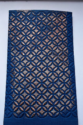
I was delighted to find that my gold Versa Color cube still had a little ink in it. I doubt if I could stamp with this ink, but the sponge still held enough ink to swipe it across an embossed panel and I love the effect.

This was quick, easy and far less messy than the polish. I used the de-bossed side of the panel and was amazed at how different the pattern appeared in reverse.
 |
| (X - Cut Folk Florals) |
 |
| (Unnamed Folder) |


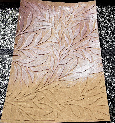
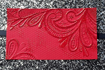
I've got a lovely powder from Altenew which is clear with just a hint of sparkle. I carefully swiped the cardfront with my Versamark pad and then sprinkled on the powder for a beautiful, sparkly finish.
 |
| (Crafter's Companion - Ornate Lace) |
 |
| (Darice - Bold Daisy) |
 |
| (Kaisercraft - Stained Glass) |
 |
| (Kaisercraft - Stained Glass reverse.) |
Hopefully, you've enjoyed my little tutorial and you're now all ready for our next challenge which is only two days away! Take care, see you soon and keep crafting!
Some lovely ideas and gorgeous effects here Jo. Love the copper on navy and the sparkle on the red is very pretty. I am digging through my stash and finding some very old mediums so this is a great push to use some of em up, or toss the ones that have died of neglect bwahhahahahaaa. Thanks for some fab technique ideas. Hugz
ReplyDeleteWow, Jo - so many beautiful textures and effects here!! My fave is still the shell one - gorgeous inking and I love the new sparkle too!!
ReplyDeleteCool examples of adding a bit of sparkle/shimmer :)
ReplyDeleteGorgeous backgrounds and a reminder that we can use other supplies with our embossing folders for spectacular results! I love using inked embossing folders and have tried both the embossed and debossed sides. Swiping metallic ink over embossing is also a favorite of mine and that copper on navy card stock is gorgeous!
ReplyDeleteI know I have some Cosmic Shimmer (some of which has also gone gloopy) but I wonder what else I have that would work. Might be time to have a look through my stash.
ReplyDeletewow, so many ideas, such great inspirations and color combinations!
ReplyDeleteWhat a great inspiration pieces, thanks for sharing.
ReplyDelete