Hi there, anyone else having trouble accepting that it's November??? Thankfully, here at Let's Squash It! a new month brings a new technique and a new challenge, so it's not all bad.
Today, I'm going to share some of my attempts to combine two of my favourite cardmaking techniques: stencilling and embossing. This really won't be a 'masterclass', but I thought I'd show you some of my hits and misses with this technique.
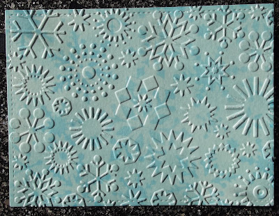
I started off by thinking I could just grab a great folder and a great stencil and the magic would just happen. However, that's not really how it went, as you can see below.
 |
| No details on stencil. EF is from Cuttlebug. |
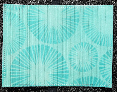
Next, I tried this...
 |
| Funky Fossil stencil and Distressed Lines EF by Creative Expressions. |
These patterns really work together to create something harmonious and rather beautiful.
This seems to work too and looks almost like fabric.
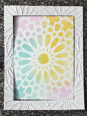
I decided to try a few other possible ways of combining a stencil and embossing folder. I think this may be 'cheating'!
 |
| AALL & Create Barbary Stars stencil and Cuttle Bug EF |
Interestingly, the embossing process very slightly 'shrinks' the embossed card because it has taken on the pattern of the folder. This means that there is no longer a perfect 'fit' when you replace the middle panel. A floral stencil would have been lovely with the daisy border.
I liked the idea of framing the stencilling, so tried this:
My next attempt is slightly better; I think there may be a slight struggle going on here, but no battle between the patterns. I LOVE the frame effect sooooooo much but the central panel should be solid for this to be hailed a success.
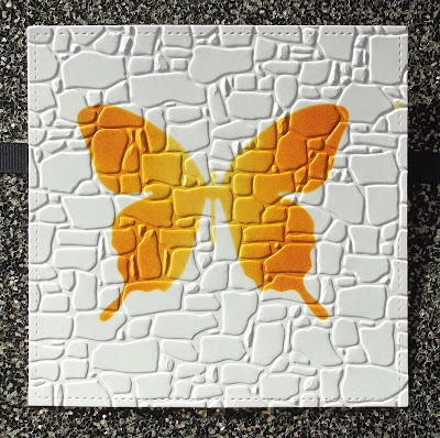
Then I had a cardmaking epiphany, and went hunting for a very simple stencil and a simple EF, where the pattern wouldn't break-up or visually fragment the stencilled image.
 |
| Papercraft Magazine stencil and Gemini EF - Set in Stone |
I hope you've enjoyed seeing my ups and downs with this technique. It's been a journey, people!
Only two days to wait for a brand new Let's Squash It! challenge... I wonder what the theme might be? 😜😜


10 comments:
This is brilliant Jo, thanks so much for showing your process and how you got there in the end xx
Great ideas and inspirations, I have never done this. Thank you so much.
Thanks for posting your "how to or not" journey. Love your final card!!
Fabulous assortment of examples, Jo! Love that you used a bunch of different combinations. They are look great, but I do agree that the simple + simple looks best. I hope to play squash in this month's challenge! :)
Thank you for the inspiration!
<3 J
jwoolbright at gmail dot com
HerPeacefulGarden.blogspot.com
I had huge issues with the technique last month and in the end gave up. It is good to see that others have difficulties as well. I will at least give this one a shot but suspect I might get frustrated with it.
Another fabulous idea, and so many great examples!! LOVE so much your experiments!! Thank you!!
I love this post Jo. We so often see only perfection, it's nice to know it doesn't always work for others as well. Thanks for experimenting so we can hop right in. I love both the ones with the distressed lines and can't wait to see what you make with those beauties. I also love the Set in Stone folder. That's gorgeous and the butterfly looks right at home there. Thanks so much for sharing your adventures. It's an awesome and inspiring post. Hugz
Interesting technique and one I haven't tried yet. Looks like you got mixed results but playing around with one's craft supplies is a lot of fun and a great way to experiment and see what works. I will give this one some thought as I haven't played here in a while and would like to join in the fun! Thank you for the awesome inspiration!
Your examples are so inspiring Jo! I love the way you've tested out different methods to share your results! I appreciate that so much as it gives a better understanding of how to incorporate the look you're after! Such a fun idea!
Thanks for the walk through different ideas, and I hope that dark corner worked. CarolG
Post a Comment